LW introduced a clear brand architecture that organized the product line into distinct, easy-to-navigate families—bringing structure and clarity to the shopping experience.
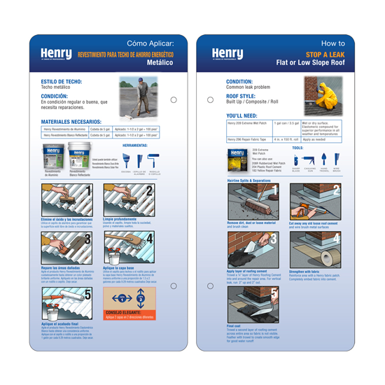
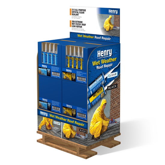
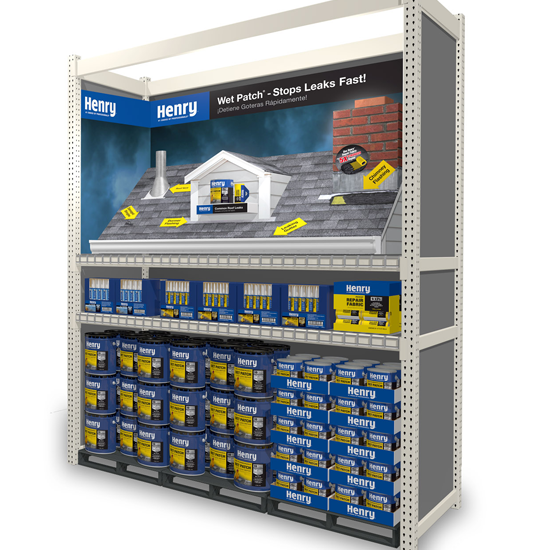
Packaging and in-line merchandising were redesigned with application-based illustrations and a strategic color system to help shoppers quickly identify the right product and build confidence at shelf.
To drive growth in key regions, LW also developed a high-impact end cap for energy-saving white roof coatings in Sunbelt markets—using bold panoramic imagery, educational messaging, and product sampling to capture attention and convert interest into purchase.